Last updated: July 19, 2026
How to Choose the Perfect Contrast Dupatta for Plain Suits (5 Colour Rules)
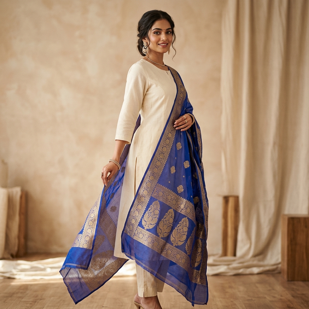
Plain kurtas and solid-colored suit sets are the unsung heroes of every Indian wardrobe. Whether it is a simple cotton kurta, an elegant raw silk tunic, or a minimalist salwar suit, solid monochrome sets are comfortable, versatile, and timeless.
However, wearing a plain single-color suit on its own can sometimes look flat or incomplete.
The easiest and most impactful way to transform a simple plain suit into a high-fashion ethnic statement is by pairing it with a contrasting dupatta. A contrasting dupatta acts as a visual frame, pulling attention toward your face, introducing texture, and creating dynamic color harmony without buying a new outfit.
In this guide, we break down 5 color theory rules to choose the perfect contrast dupatta for any plain suit in your closet.
Rule 1: The Temperature Harmony Principle (Warm vs. Cool Base)
Before selecting a contrast color, identify whether your base suit has a Warm or Cool undertone:
- Warm Suits: Base colors like mustard yellow, terracotta, olive green, warm cream, rust, or saffron.
- Cool Suits: Base colors like sapphire blue, icy lavender, magenta, cool slate grey, emerald, or crisp white.
The Golden Rule: Keep your contrast dupatta within the same temperature family as your suit, unless intentionally using a complementary color pair.
| Plain Base Suit Color | Ideal Warm Contrast Dupatta | Ideal Cool Contrast Dupatta |
|---|---|---|
| Plain White / Off-White | Saffron Orange, Marigold Gold | Royal Indigo, Magenta Pink |
| Plain Navy Blue | Mustard Yellow, Burnt Orange | Cool Silver, Mint Green |
| Plain Black | Deep Crimson Red, Emerald | Hot Pink, Bright Turquoise |
| Plain Bottle Green | Terracotta, Warm Amber | Powder Pink, Lilac |
Rule 2: Complementary Contrast (Opposites on the Color Wheel)
Complementary contrast pairs two colors that sit directly opposite each other on the color wheel. This creates the highest visual energy and makes your outfit instantly stand out.
- Yellow Base Suit + Royal Blue Dupatta: The brightness of yellow balances the deep stability of royal blue.
- Emerald Green Suit + Ruby Red / Magenta Dupatta: A classic festive pairing that feels opulent and regal.
- Teal Blue Suit + Warm Coral / Peach Dupatta: A refreshing modern contrast perfect for daytime functions and office wear.
Rule 3: The Neutral Anchor Rule for Plain Kurtas
If your plain suit is a neutral shade (Ivory, Beige, Slate Grey, or Black), your suit acts as a clean canvas.
When styling neutral base suits, choose a dupatta with high color saturation:
1. Ivory or Beige Suit: Pair with a rich Banarasi silk dupatta in deep plum, maroon, or peacock green.
2. Slate Grey Suit: Pair with a soft pastel pink or lilac organza dupatta to soften the grey tone.
3. Jet Black Suit: Pair with a vibrant Phulkari or Bandhani dupatta featuring multiple warm accent threads.
Rule 4: Fabric & Weight Balancing
Garment color perception is heavily influenced by fabric texture. A heavy silk dupatta will reflect light differently than a sheer chiffon dupatta.
- Light Cotton Kurtas: Pair with lightweight chiffon, kota doria, or linen dupattas so the dupatta doesn't overpower the light drape of the kurta.
- Heavy Silk or Chanderi Kurtas: Pair with structured Organza, Jacquard, or Velvet dupattas that match the regal richness of the base fabric.
Rule 5: Skin Undertone Placement
Because your dupatta drapes around your shoulders and neck, its color sits directly next to your face.
- Warm / Golden Skin Undertones: Ensure the dupatta features warm golden, warm red, or coral highlights.
- Cool / Rosy Skin Undertones: Choose dupattas with cool berry, jewel sapphire, or crisp silver undertones to brighten your facial glow.
Frequently Asked Questions
Q: Can I wear a printed contrast dupatta with a printed suit?
A: It is best to pair printed or heavily embroidered contrast dupattas with plain, solid-colored suits. Combining heavy prints on both the suit and dupatta can create visual clutter.
Q: What dupatta color goes with a plain yellow kurta?
A: A plain yellow kurta pairs beautifully with a royal blue, deep teal, or rich bandhani red dupatta for high-impact contrast.
Curious which dupatta colors match your exact skin tone and wardrobe? Download Colourity AI to scan your complexions and automatically match outfits from your clothes.